Brief
The aim is to examine Visual Communication Design through research, rhetoric, semiotics, macro/micro aesthetic design, and transmedia narrative.
Your task is to design a ‘provocation’ for a Designers Institute of New Zealand (dinz) one-day conference on the topic of communication design. The conference will be held at Massey University Wellington Campus and identifies a number of national and international speakers: a compelling event aimed at attracting design students, educators, as well as practitioners. The programme information will be rolled out via trans-media narrative (3 x touchpoints – Engage, Inform, Experience) and should be provocative and compelling.
You will research design and designers in order to develop a suitable theme for your conference. To communicate this theme, you will develop a transmedia strategy that considers audience (user centred design) and uses a rhetorical approach, semiotics, and macro/micro design – melding type and image into a whole, from ‘big picture’ concept through to graphic detailing. Your iterative process should investigate various modes of concept generation and implementation aiming to transform information so as to attract and inform.
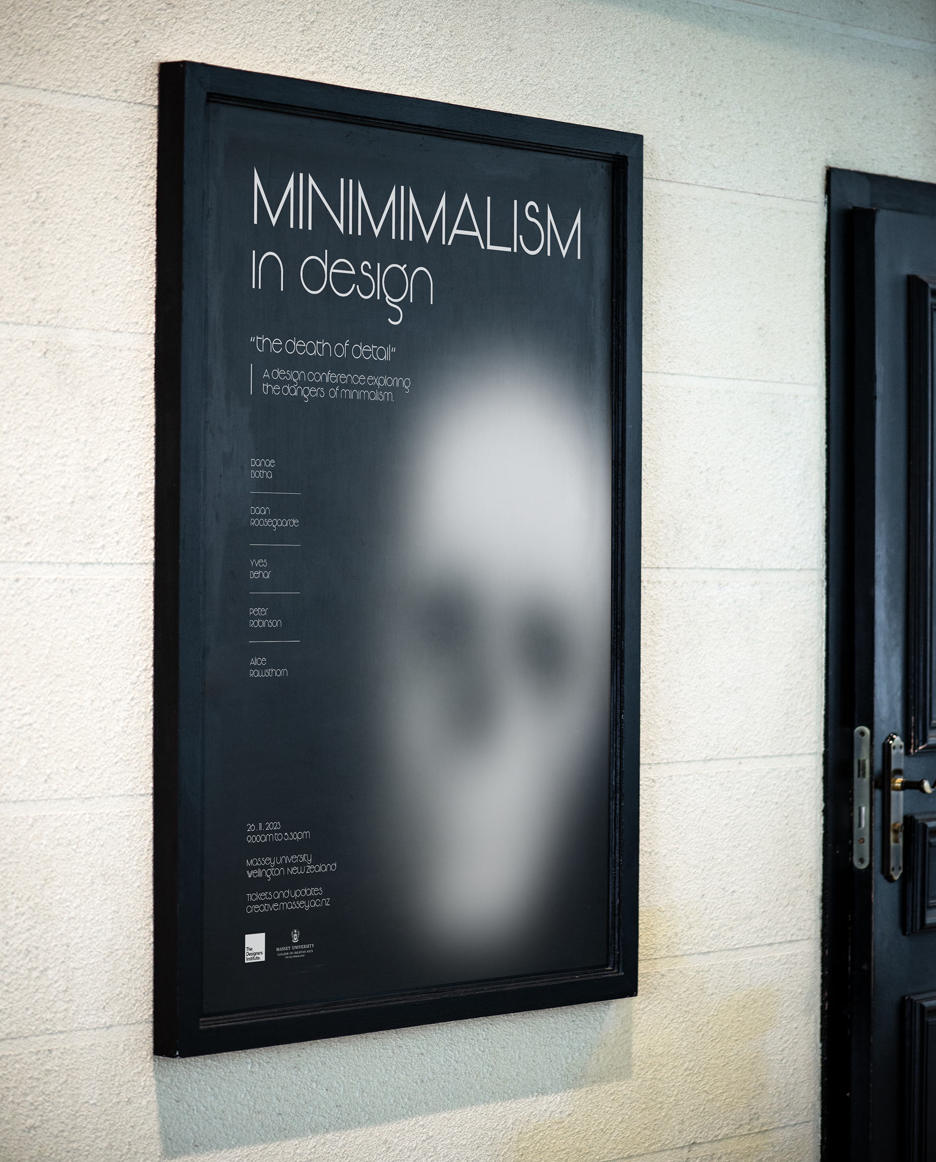
My conference explores the theme of ‘Minimalism in Design’, specifically the downfalls of it, I use the idea of “the death of detail” to communicate this. With minimalism being a popular design trend it has become oversaturated and is leading to a lack of creativity and originality in design.
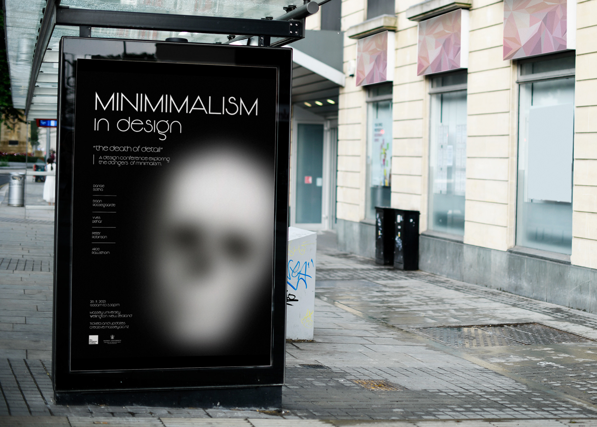
I have employed a minimalistic approach with a touch of irony. In my poster the skull has intentionally been blurred to obscure its recognition, and the text is in tandem with the dark nature of the skull, explicitly stating “the death of detail,” which serves to exaggerate the notion that minimalism has it’s limitations. The use of contrasting elements has been deliberately employed to prompt the viewer to contemplate the concept of minimalism, with a minimalistic font that appears aesthetically pleasing but becomes increasingly difficult to read upon further examination. The restricted use of colour also serves to support the minimalistic approach and creates a somber and melancholic tone.
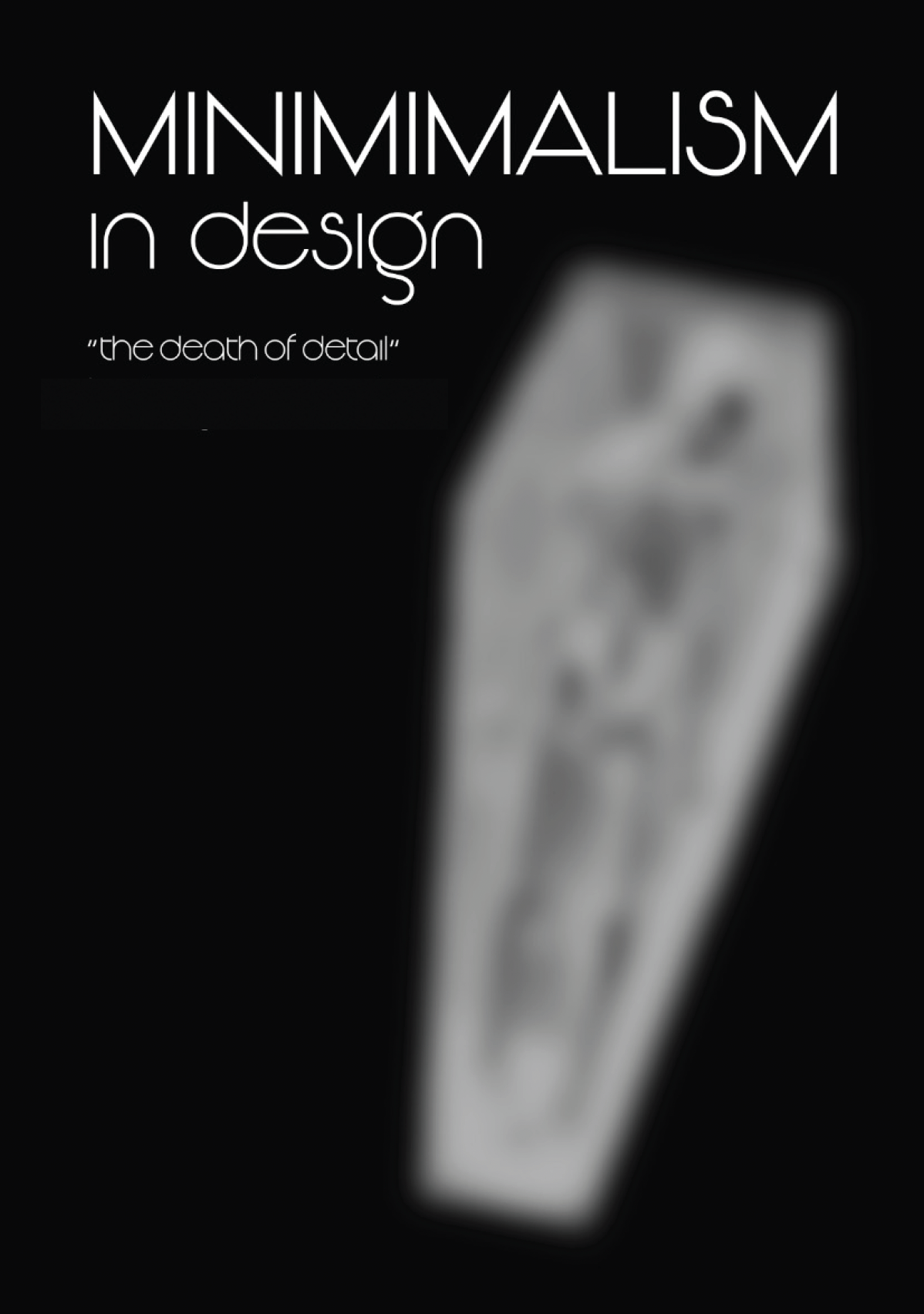
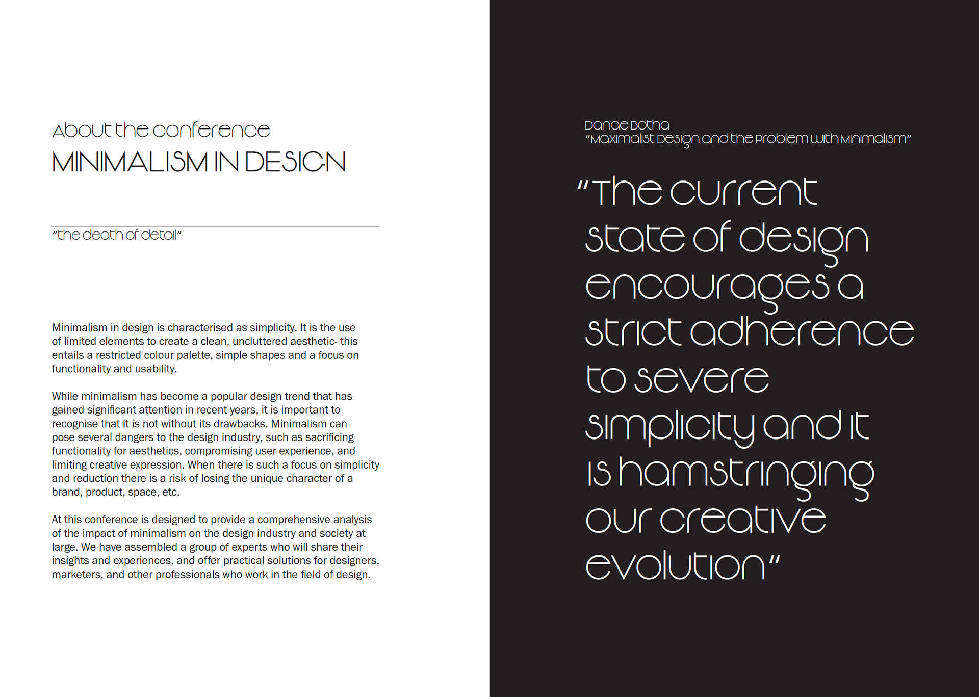
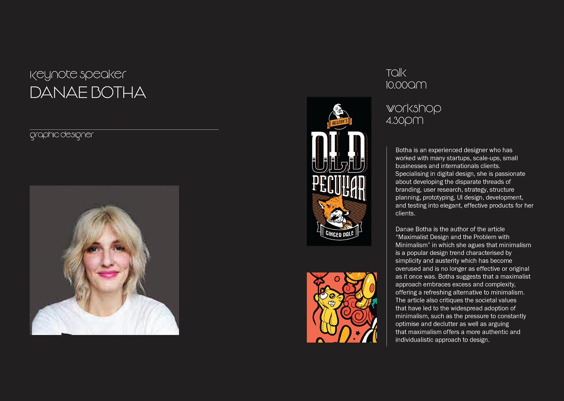
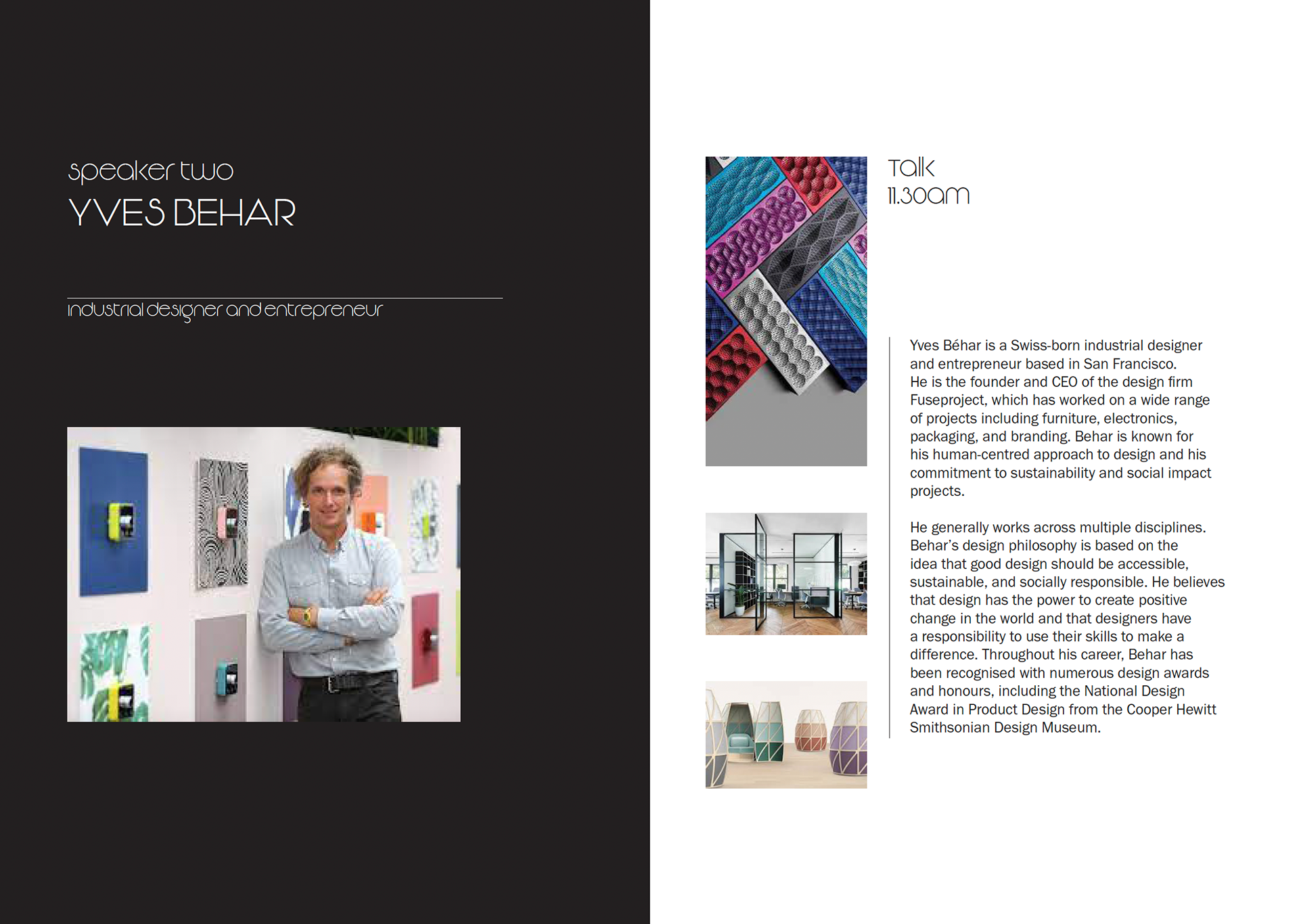
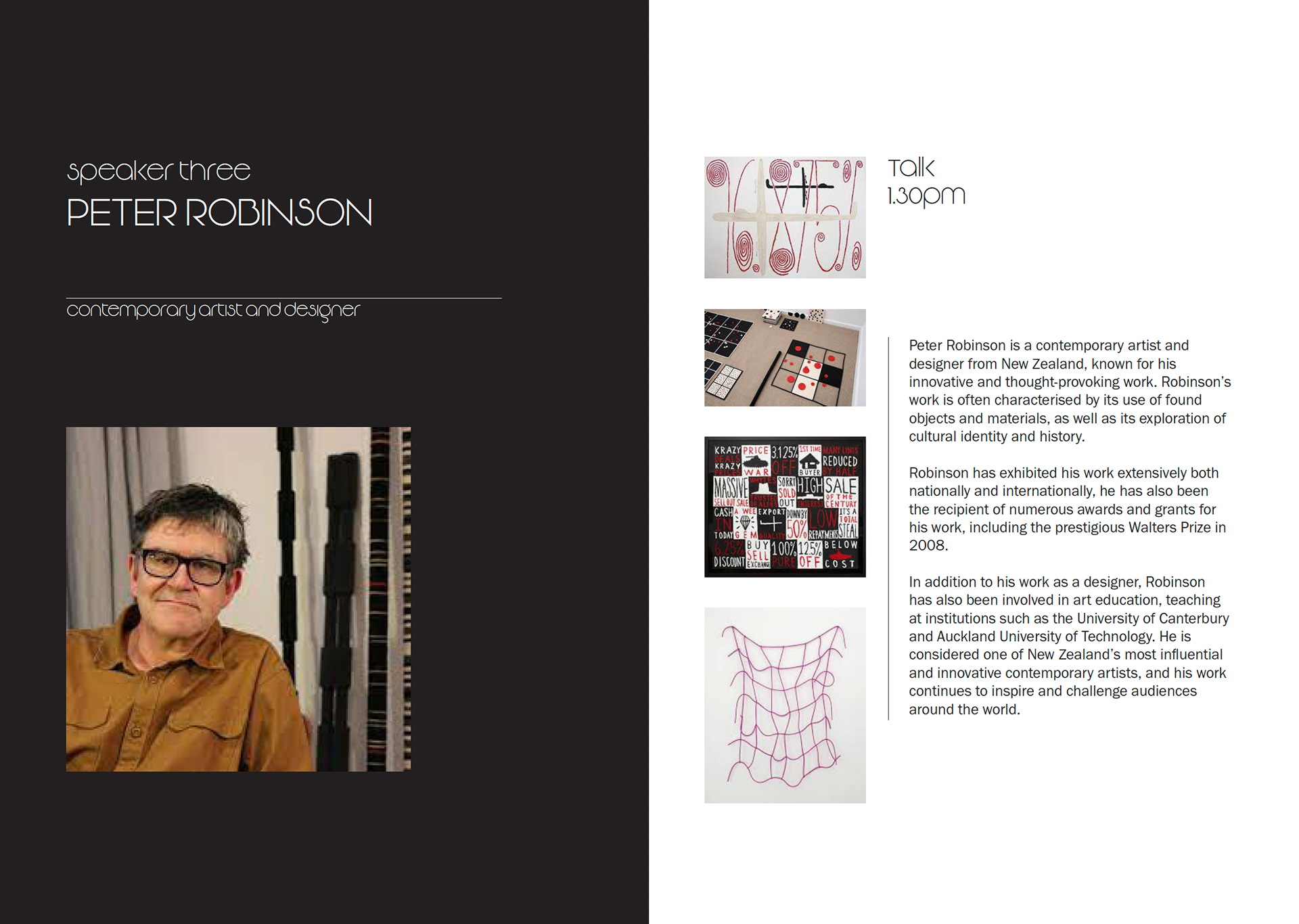
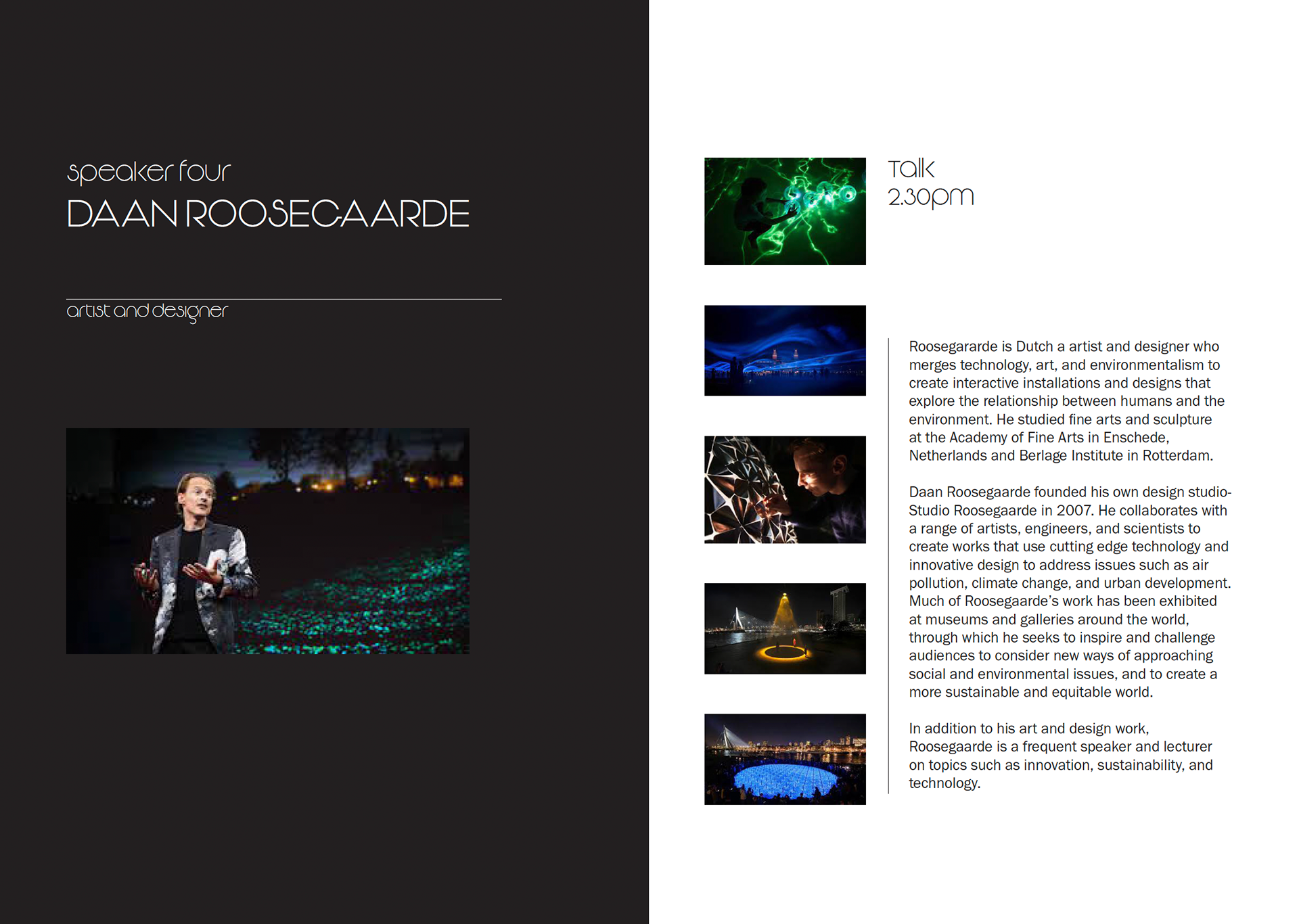
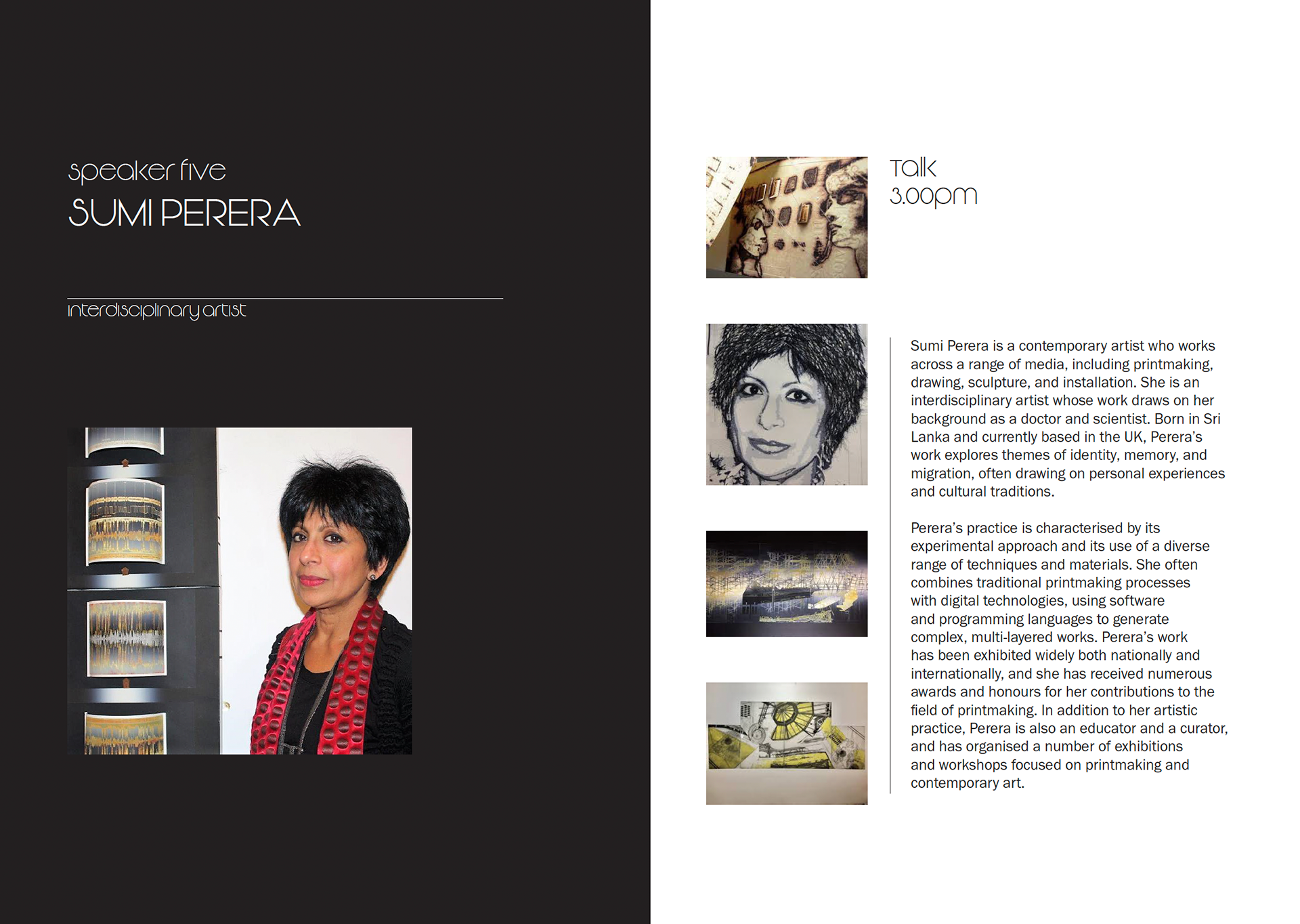
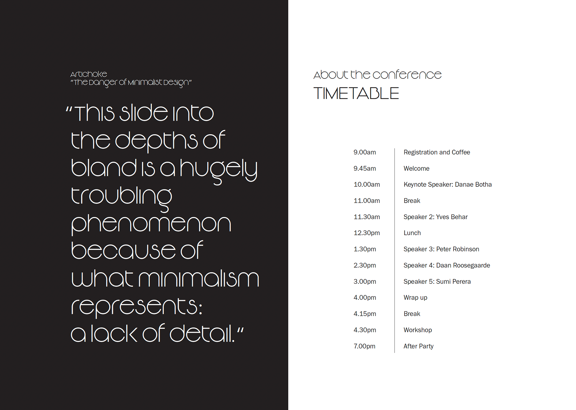
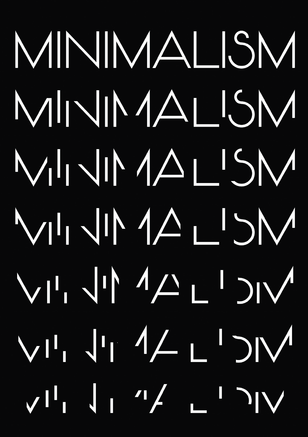
Similarly, the brochure also follows a comparable approach, with the imagery of a coffin and a skeleton used to represent death. The base layout of the cover page is consistent with that of the poster, making them easily identifiable to each other. Majority of the pages follow a standard format, with a few exceptions, e.g. the quote pages. The back cover page presents a typographic representation of the negative aspects of minimalism, which relates to the experience touchpoint.
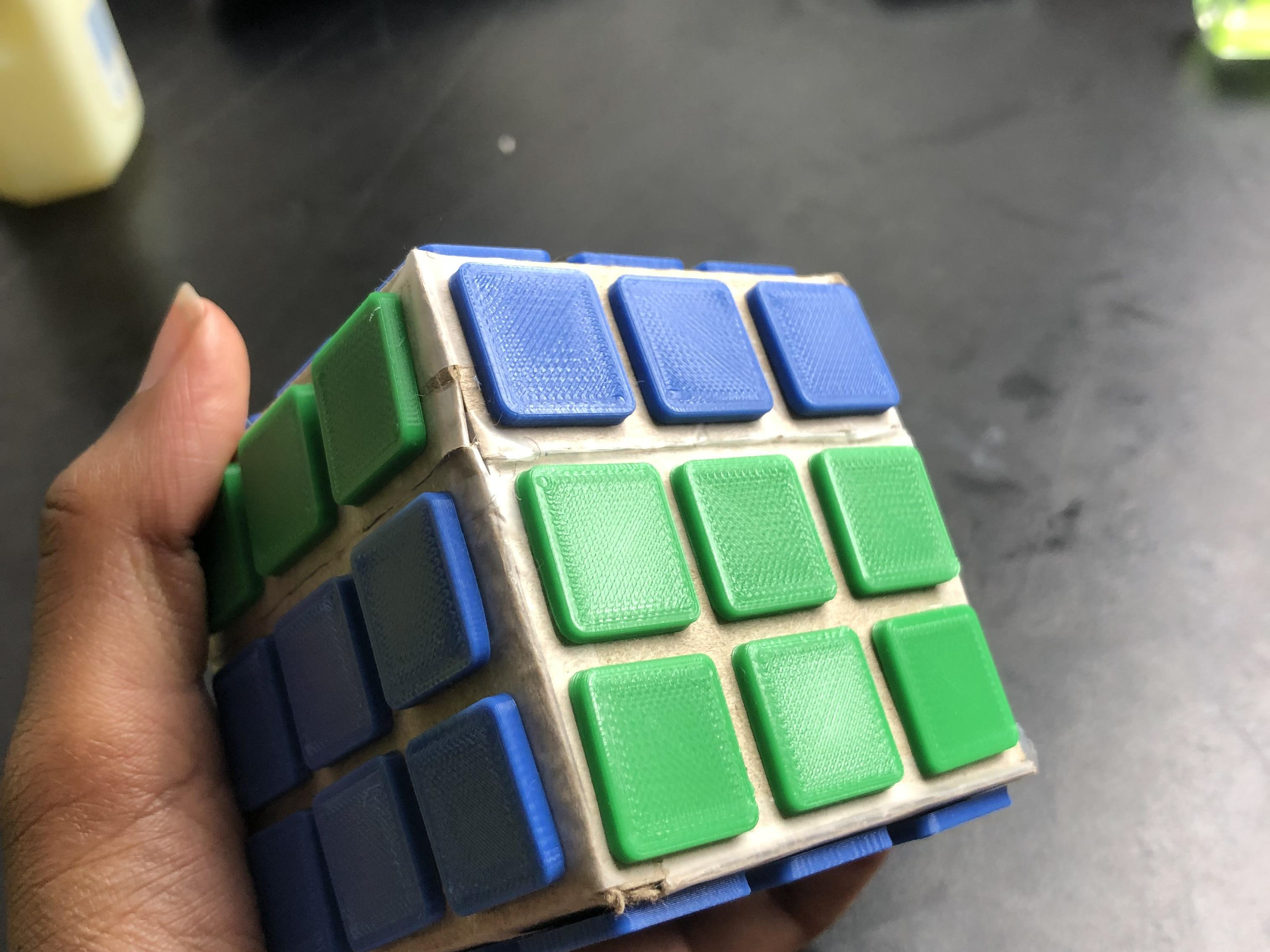
The experience design is intended to demonstrate the shortcomings of minimalism in design, with a focus on interactivity to ensure that the experience is memorable and thought-provoking.
My three touchpoints work together with the ironic minimalist approach, colour scheme and imagery creating a strong transmedia campaign.
